Plotting
Plotting is where cf_xarray really shines in our biased opinion.
from cf_xarray.datasets import airds

air = airds.air
air.cf
Coordinates:
             CF Axes: * X: ['lon']
                      * Y: ['lat']
                      * T: ['time']
                        Z: n/a

      CF Coordinates: * longitude: ['lon']
                      * latitude: ['lat']
                      * time: ['time']
                        vertical: n/a

       Cell Measures:   area: ['cell_area']
                        volume: n/a

      Standard Names: * latitude: ['lat']
                      * longitude: ['lon']
                      * time: ['time']

              Bounds:   n/a

       Grid Mappings:   n/a
Tip
Only DataArray.plot is currently supported.
Using CF standard names
Note the use of "latitude" and "longitude" (or "X" and "Y") in the following as a “standard” substitute for the dataset-specific "lat" and "lon" variables.
air.isel(time=0).cf.plot(x="X", y="Y")
<matplotlib.collections.QuadMesh at 0x7dbc4ba868d0>

air.cf.isel(T=1, Y=[0, 1, 2]).cf.plot(x="longitude", hue="latitude")
[<matplotlib.lines.Line2D at 0x7dbc49762690>,
 <matplotlib.lines.Line2D at 0x7dbc4974a9d0>,
 <matplotlib.lines.Line2D at 0x7dbc49762c50>]

air.cf.plot(x="longitude", y="latitude", col="T")
<xarray.plot.facetgrid.FacetGrid at 0x7dbc49795690>

Automatic axis placement
Now let’s create a fake dataset representing a (x,z) cross-section of the ocean. The vertical coordinate here is “pressure” which increases downwards.
We follow CF conventions and mark pres as axis: Z, positive: "down" to indicate these characeristics.
import matplotlib as mpl
import numpy as np
import xarray as xr

ds = xr.Dataset(
    coords={
        "pres": ("pres", np.arange(20), {"axis": "Z", "positive": "down"}),
        "x": ("x", np.arange(50), {"axis": "X"})
    }
)
ds["temp"] = 20 * xr.ones_like(ds.x) *  np.exp(- ds.pres / 30)
ds.temp.cf
Coordinates:
             CF Axes: * X: ['x']
                      * Z: ['pres']
                        Y, T: n/a

      CF Coordinates: * vertical: ['pres']
                        longitude, latitude, time: n/a

       Cell Measures:   area, volume: n/a

      Standard Names:   n/a

              Bounds:   n/a

       Grid Mappings:   n/a
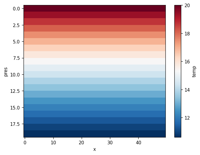
The default xarray plot has some deficiencies
ds.temp.plot(cmap=mpl.cm.RdBu_r)
<matplotlib.collections.QuadMesh at 0x7dbc485bfad0>
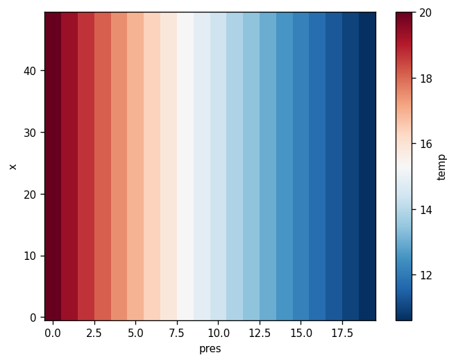
cf_xarray can interpret attributes to make two decisions:
That
presshould be the Y-AxisSince
presincreases downwards (positive: "down"), the axis should be reversed so that low pressure is at the top of the plot. Now we have a more physically meaningful figure where warmer water is at the top of the water column!
ds.temp.cf.plot(cmap=mpl.cm.RdBu_r)
<matplotlib.collections.QuadMesh at 0x7dbc48487e50>